Be Seeing You

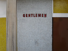
There are so many things to love about the Barbican. The fact that it's the only luxury brutalist housing complex to have a roots reggae record made in tribute to it (Keith Hudson's 'Barbican Dub', the chorus of which is 'me love it inna Barbican' - unless there's a Unite d'habitation Dub or more likely Trellick Tower Rockers I don't know about); the obsessive-compulsive plan, built, revised and replanned constantly from the late 50s to early 80s, intricate tweaking producing a labyrinth of raw concrete and Ballardian vines; and best of all, how the signs (without which the place would be entirely inexplicable) have the exact same typography as that used for The Village in The Prisoner, as if to make the point about sinister ex nihilo communities explicit.

Seeing as I'm currently working my way through the entire series (now there's a Christmas present) I'm currently restraining myself from googling almost anything remotely related to The Prisoner in case of spoilers, so any mistakes in what follows can be put down to that. There is something fascinatingly contemporary about Portmeirion, the real village which serves as the series' concentration camp: the buildings are outwardly riven with historical pastiche, and frequently inside them is a showcase of fantastical technology worthy of Archigram.

However its architect, Clough Williams Ellis, much unlike the aesthetic reactionaries of today, was unequivocally of the Left, intent on 'more fun for more people', and as I recently found in a biography of Lubetkin, Williams Ellis was an aficionado of the Soviet architectural scene of the late 20s and early 30s - even travelling there to meet Moisei Ginsburg and his Constructivist allies in the mid 30s, while he was working on Portmeirion. Although Portmeirion itself has more in common with the Stalinist styles of the late 30s-50s, its fascinating to think this tightly planned ideal community might have derived itself in some way from say, Ginsburg's Narkomfin apartments. Which would make the Barbican the missing link between the two, its unequivocal modernism evoking the Soviet avantgarde, while its street signs pay oblique tribute to a traditionalist utopian. Or it could be the architects' little joke.

All this is a preamble to a discussion of what I did on New Year's Eve (well, on the stroke of midnight I was in a frankly slightly terrifying restive mob by the Thames: akin to being on a demonstration gone nasty, only without the point but with all the fervour), a wander round the deserted complex with my sister in tow to pay a visit to the In The Face of History photography exhibition in the galleries. The premise of the show was a slightly dubious one, emphasising the 'photographer-participant' rather than the creator or abstractionist, presumably to maintain the bizarre fiction that the camera never lies - but the works themselves are mostly excellent, building up the intended picture of 20th century Europe that combines privacy and historical sweep.

Picks in amongst a pretty high standard would be first the Red 1968-75 series by Boris Mikhailov, a Ukrainian photographer dismissed from his job in the mid 60s when his employer found nude shots of his wife ('how awful', you think, and then realise the exact same thing would have happened in the 'west' at the time). Though posited as a satire on Soviet triumphalism, the photographs actually evoke a rather sweet conjunction of the quotidian- burst blisters, sagging flesh, boredom, bad clothes- and chromatically jolting beauty- red hair, red flags, red lipstick, red murals on the side of an apartment block, a record of an aestheticised everyday life now disappeared. Mikhailov appears later on in the exhibition's ah, 'End of History' segment, via a grim series of sepia pictures of an utterly devastated post-independence Ukraine.

The other highlight was a room showing slides from Annelies Strba's Shades of Time. Something about this put me in the mind of the (surely imaginary) Tiny Colour Movies of John Foxx, a series of discrete memories so elegantly blurred, their colours so nostalgically lurid, that you imagine the family history they record to be purely fictional, so intense and elegiac are the slides. This effect is added to by a constant rumble that at first seems like the click-clack of the projector itself, which after a while you realise is a Basic Channel-esque pulse of indistinct hiss and rhythmic certainty. The photos build up of the not in itself fascinating life of a Swiss family, jolted into poignancy and eroticism by the saturated colour of the old film and the ambiguity of the sitters, alternating with equally peculiarly sad architectural photographs, mainly of apartment blocks everywhere from Switzerland to Japan, worn records of experiments in communal living.

This is most likely all utterly wasted on the burghers of the Barbican, who all seem to rent there solely for their working weeks in the City, presumably keeping mistresses there before bunking off home to Herts at the weekend (look at the three Barbican skyscrapers at night and note how few of the room lights are ever on). Aside from me, my sister and the staff, the only people in the gallery were an astoundingly tight arsed looking middle aged couple who strode round the gallery with a look of grim obligation, steeling themselves through the Art with the future dinner conversation in mind. Perhaps it should all be moved somewhere similar, but where people might appreciate it. Thamesmead perhaps, or The Village.
posted by owen hatherley at 12:48 am


0 Comments:
Post a Comment
<< Home